Vela is a UX research and product design project exploring how AI chat interfaces can be redesigned to foster more honest, transparent interactions.
Named after a southern constellation, Vela uses navigation as a metaphor: AI can help people orient their thinking without deciding their direction. It also evokes the idea that we share the same sky, yet see and interpret it differently—a reminder that no single perspective offers a complete picture.
Vela asks what it would look like if an AI interface communicated its own nature honestly, rather than projecting false confidence and singular truth.
Problem
AI chat interfaces present synthesised outputs as singular authoritative answers, obscuring uncertainty, plurality and bias. Research revealed that users accept AI outputs passively — not because they lack critical thinking, but because the interface gives them no reason to pause.
Solution
AI chat interfaces present synthesised outputs as singular authoritative answers, obscuring uncertainty, plurality and bias. Research revealed that users accept AI outputs passively — not because they lack critical thinking, but because the interface gives them no reason to pause.
Empathise
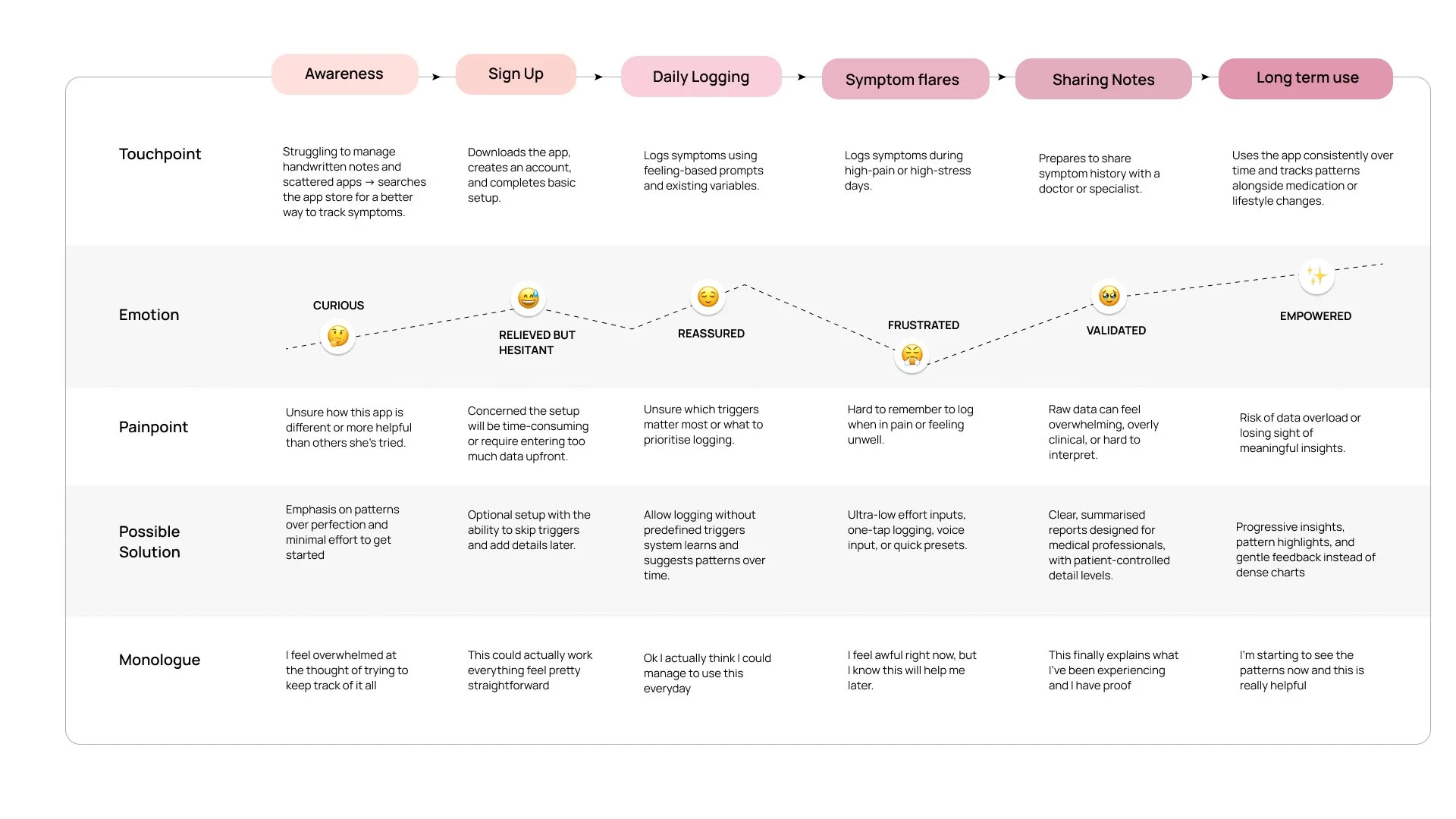
Research was conducted through interviews with people managing chronic health conditions, validated through a broader survey. The findings were clear: existing tools fail not because of poor design, but because they treat health as isolated data points rather than a lived experience. Mapping the full user journey revealed that the most critical design moments were during symptom flares and when sharing with medical professionals.
78%
of people interviewed feel that tracker apps don’t allow them to record everything they need
90%
of people interviewed find it hard to keep consistent in tracking their symptoms
82%
feel alone or helpless at times in their health jounrey
Ideate
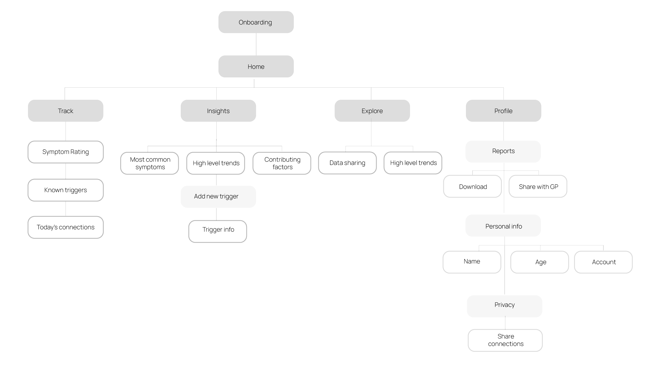
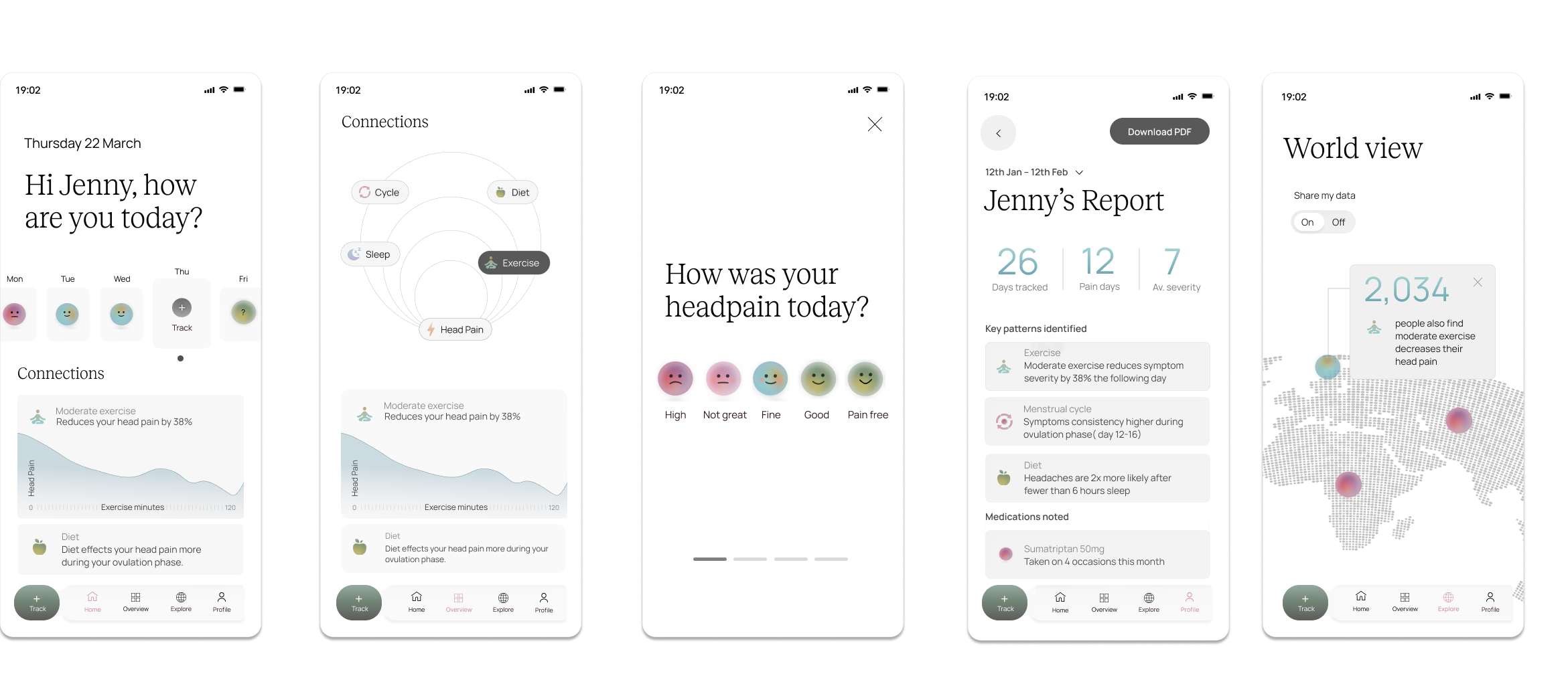
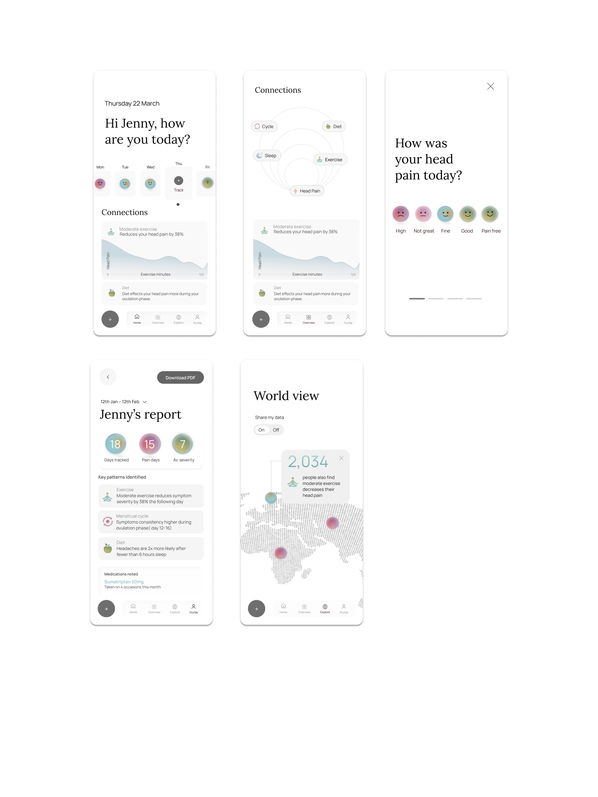
Iteration was driven by user feedback at every stage from language choices (moving away from "triggers" for its negative connotations) to navigation structure, tested across four versions before landing on the clearest path. The architecture reflects the app's core philosophy: whole-person health, where tracking, insights, and community data sit in conversation with each other.
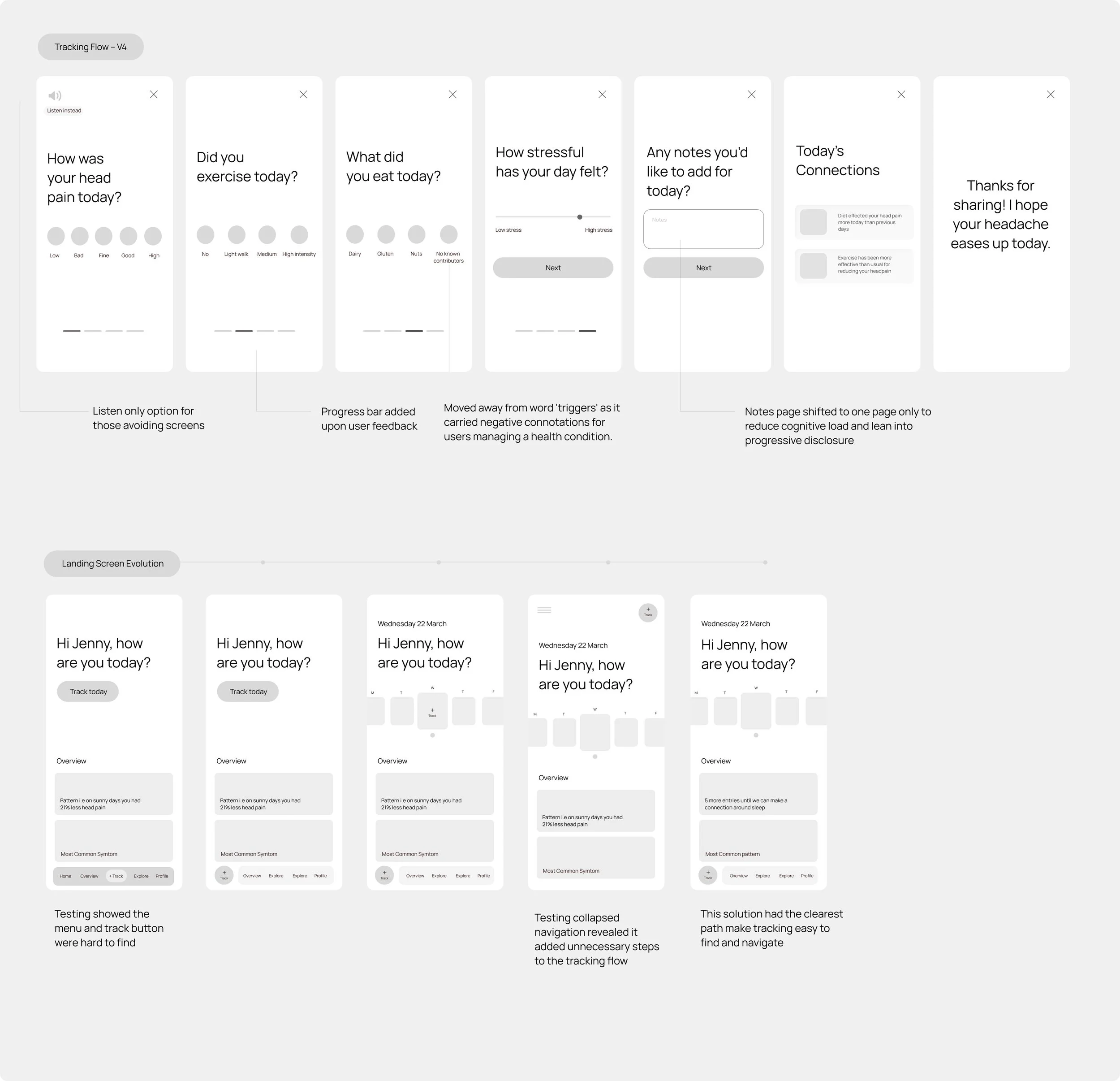
Prototype
Visual simplicity was a conscious accessibility decision. Users managing migraines and chronic conditions often experience light sensitivity, brain fog, and fatigue. A calm, low-stimulus interface means the app remains usable on the hardest days.