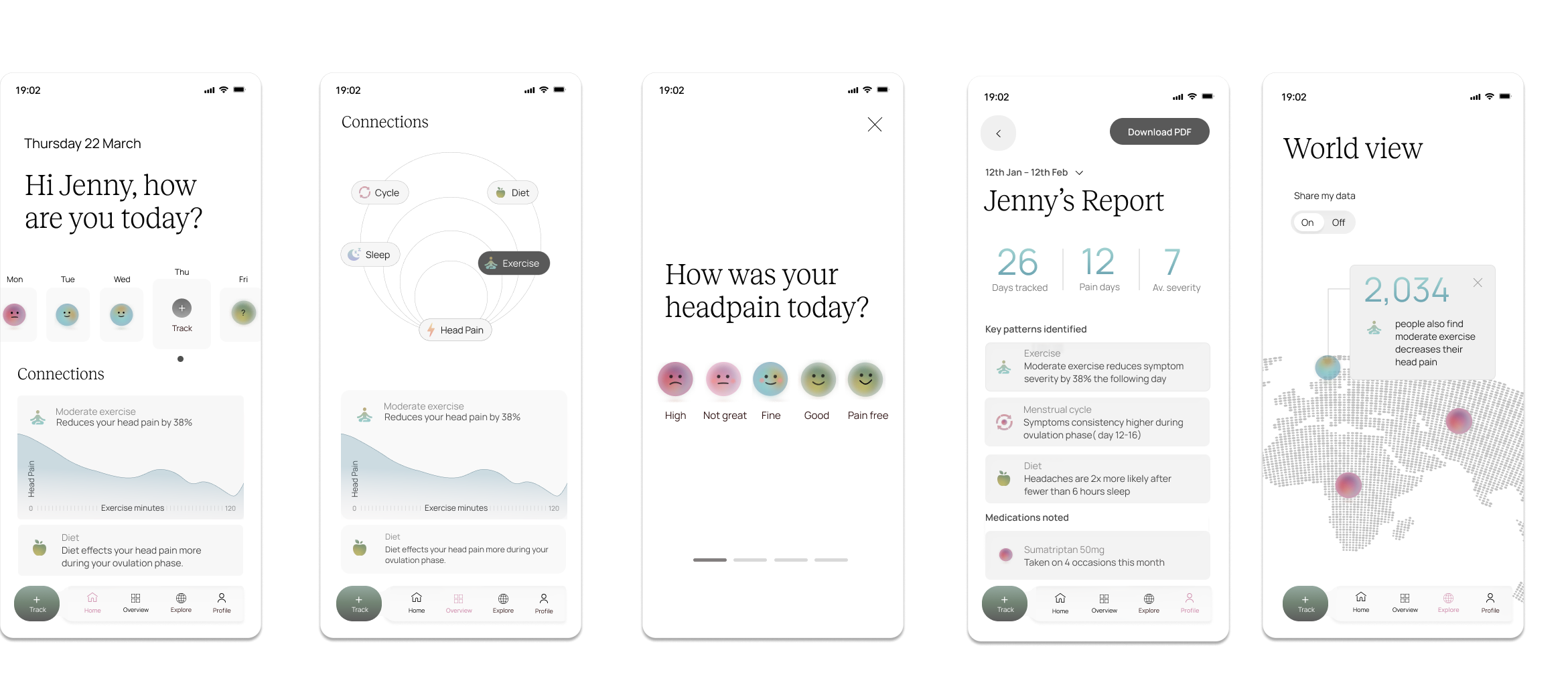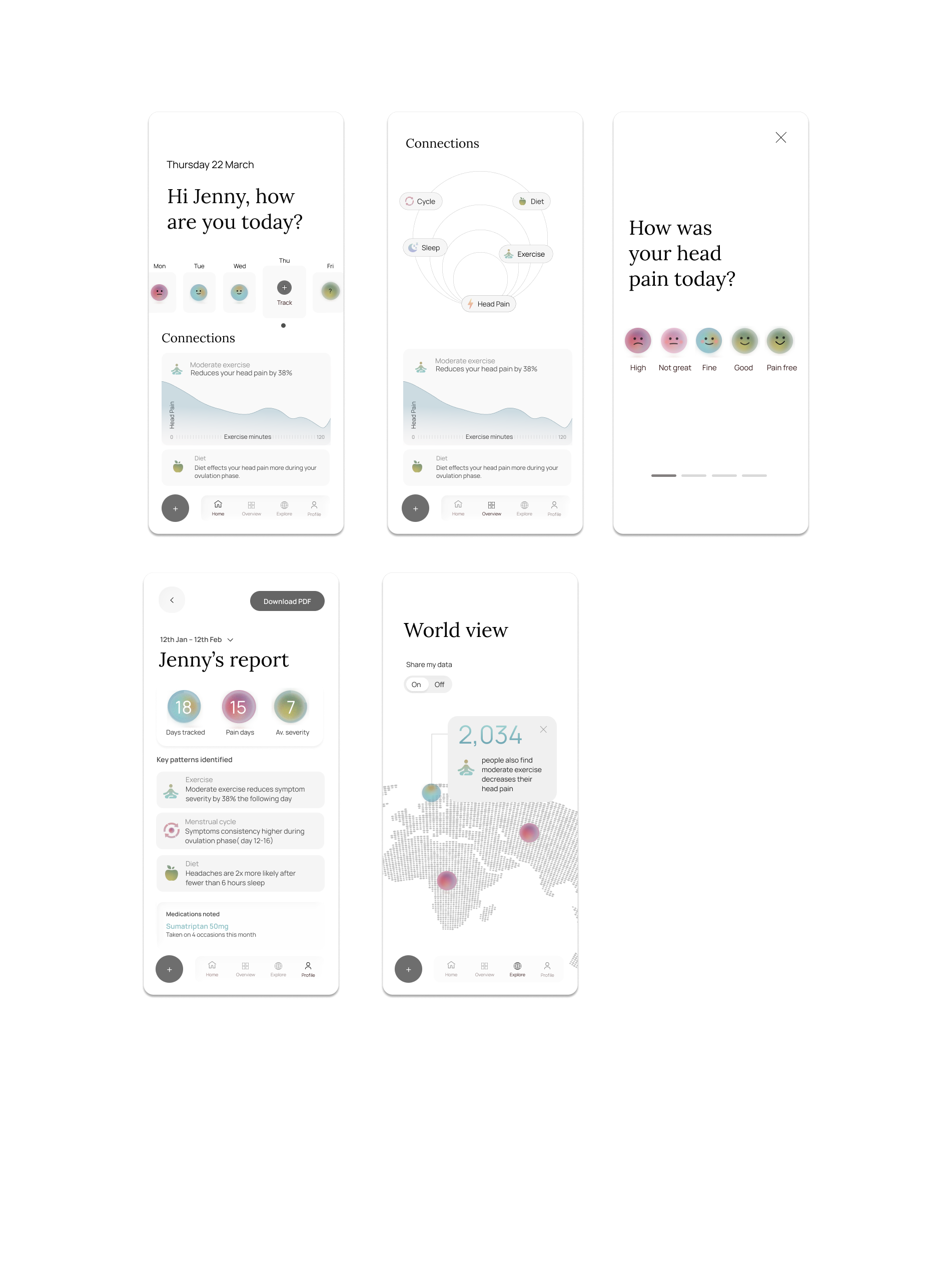
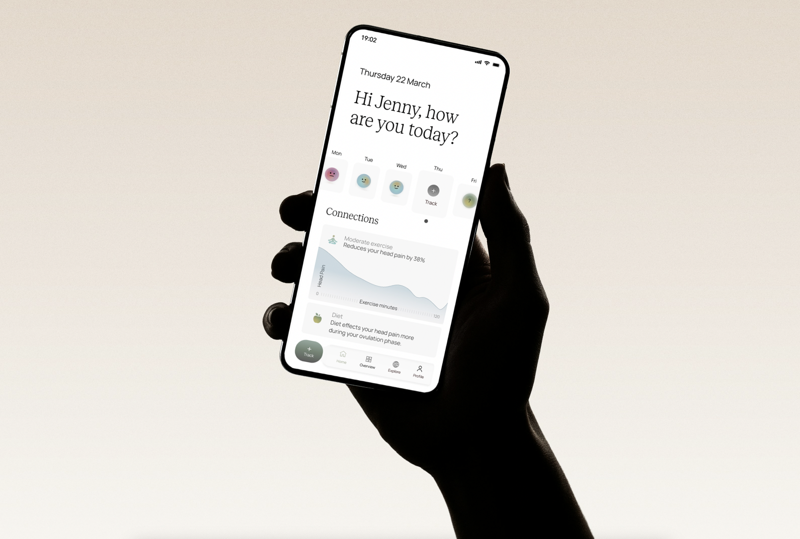
Connect follows a whole-person care approach to a symptom tracker app. Built around the belief that health doesn't exist in isolation and neither should the people managing it.
Problem
For people managing chronic or recurring health conditions, the experience is rarely just physical. It's the frustration of not knowing what's making things worse. The exhaustion of trying to explain it to a doctor with nothing concrete to show. And often, a quiet sense of being alone in it surrounded by people who don't quite understand what day-to-day life feels like.
Solution
The app tracks the full picture of a person's day, surfaces meaningful connections between lifestyle factors and symptoms, and generates clear reports designed to support real conversations with healthcare providers. And through World View, users can see anonymised insights from others in the community, what's helping people like them, what patterns others have noticed. This turning a solitary experience into a shared one.
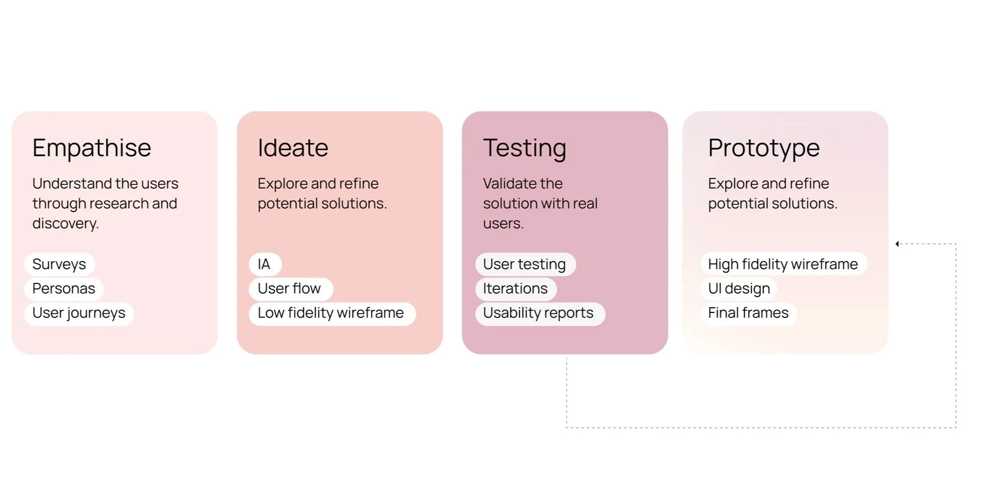
Empathise
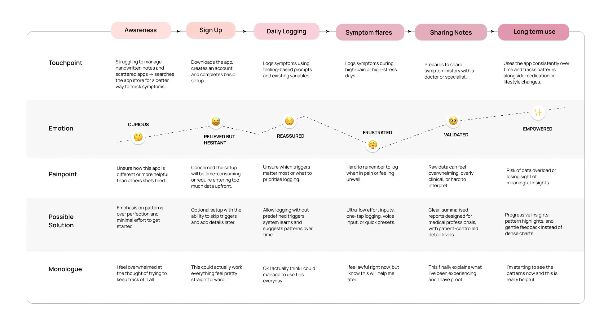
Research was conducted through interviews with people managing chronic health conditions, validated through a broader survey. The findings were clear: existing tools fail not because of poor design, but because they treat health as isolated data points rather than a lived experience. Mapping the full user journey revealed that the most critical design moments were during symptom flares and when sharing with medical professionals.
78%
of people interviewed feel that tracker apps don’t allow them to record everything they need
90%
of people interviewed find it hard to keep consistent in tracking their symptoms
82%
feel alone or helpless at times in their health jounrey
Ideate
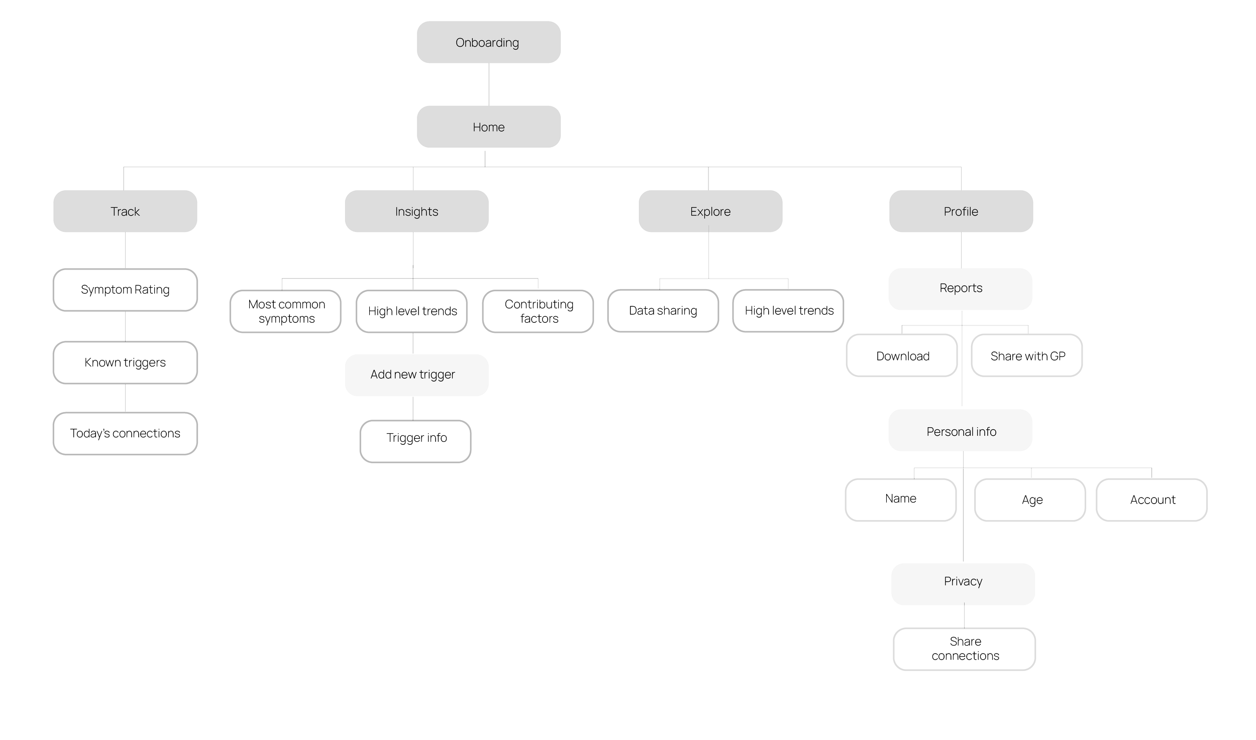
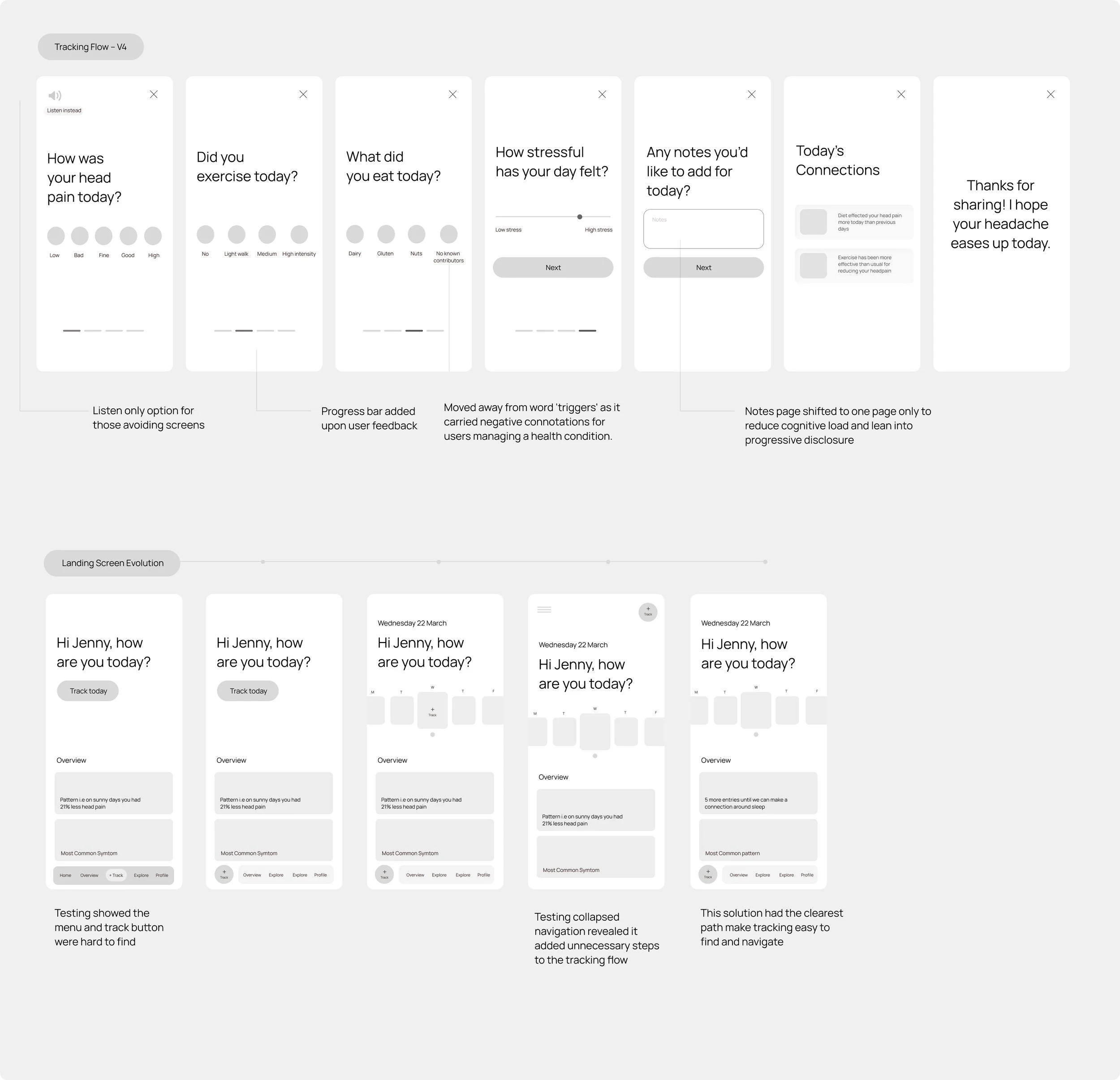
Iteration was driven by user feedback at every stage from language choices (moving away from "triggers" for its negative connotations) to navigation structure, tested across four versions before landing on the clearest path. The architecture reflects the app's core philosophy: whole-person health, where tracking, insights, and community data sit in conversation with each other.
Prototype
Visual simplicity was a conscious accessibility decision. Users managing migraines and chronic conditions often experience light sensitivity, brain fog, and fatigue. A calm, low-stimulus interface means the app remains usable on the hardest days.